On this page
- Conversational UI design comes down to four moments
- Set expectations before the first message
- Conversation design: write turns before you draw screens
- Chatbot UI design patterns that earn their place
- When the AI is wrong: recovery and the human handoff
- Voice user interface design: what changes without a screen
- Accessibility for chat and voice interfaces
- What Google, Apple and Microsoft agree on
- Measuring AI chat UX: the numbers that tell the truth
- Frequently asked questions
- What we’d do first
A customer opens the chat bubble on a furniture store at 11pm and types “will the oak table fit through a 30 inch door.” The bot answers with four paragraphs about the brand’s commitment to craftsmanship, then asks if there is anything else it can help with. She closes the tab. The model could have answered. It was a conversational UI design problem. Nobody had decided what the first sentence of an answer should contain. Or where the “talk to a person” button lives.
This is the guide we hand product teams before they build a chat or voice assistant: the principles Google, Apple and Microsoft agree on, the interface patterns worth building, what changes for voice and screen readers, and how to measure whether people actually trust the thing.
Key takeaways
- Trust is won or lost at four moments: the empty state, the answer, the mistake and the handoff.
- Put the answer, or the limitation, in the first sentence. Users treat site chatbots like search bars.
- Suggested prompts should be buttons, kept fresh after every reply. Don’t autoscroll a streaming answer to the bottom.
- In voice, every response should pass the one-breath test.
- Measure true resolution, not containment. Ending without a human is not the same as solved.
Conversational UI design comes down to four moments
Good conversational UI design means deliberately designing four moments: what people see before they type, how an answer arrives, what happens when the system is wrong, and how a person takes over. Most teams design the second one and improvise the rest.
That framing isn’t ours alone. Microsoft Research’s Guidelines for Human-AI Interaction (CHI 2019, the basis of the HAX Toolkit) sort 18 guidelines into almost the same buckets: “initially”, “during interaction”, “when wrong” and “over time”. They were validated with 49 design practitioners against 20 AI products, and seven years on the list still reads as current.

One caveat first. If a task is “pick a size and pay”, a form beats a chat every time, and we push back on chat when the goal fits on one screen. Apple’s guidance says much the same: use generative features where they add clear value, and keep a non-AI path where you can.
Set expectations before the first message
Use the empty chat window to say what the assistant can and cannot do, in one or two lines, plus a few tappable examples. Skip it and users either ask for the impossible or assume the bot does almost nothing.
HAX guidelines 1 and 2 split this into what the system can do and how well it does it. The second gets dropped constantly. “I can help with orders, returns and sizing. For warranty claims I’ll connect you to the team” covers both in under 20 words.
Nielsen Norman Group’s April 2026 guidelines for site AI chatbots add specifics we now treat as defaults:
- One entry point. A retailer running two separate bots left participants unsure which to use. Merge live chat and AI behind one launcher.
- Keep it reachable across pages, without resetting the conversation.
- Tailor the greeting to the page. A generic “ask me anything” overpromises.
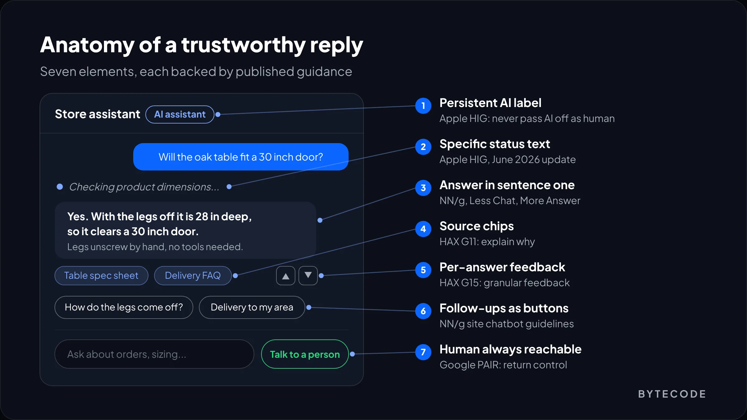
Apple’s Human Interface Guidelines for generative AI (last updated June 8, 2026) are blunt on disclosure: tell people where AI is used, and never let them think they are talking to a human when they aren’t. We’d add a permanent “AI assistant” label in the chat header. It costs nothing and heads off the angry “I thought you were a person” tickets.
From our team: write the capability line last, after you’ve tested the bot. Teams that write it first describe what they hoped to build. Teams that write it after a week of transcript review describe what they actually shipped, and users notice the difference.
Conversation design: write turns before you draw screens
Conversation design is writing the exchange itself, from the opening line to how the assistant says “I can’t do that.” Do it before visual design, in plain sample dialogs, because a beautiful chat panel can’t rescue a bad turn.
Our process is unglamorous: a shared doc with 15 to 25 sample dialogs, including the vague question, the angry customer and the user who types one word. We read them aloud and cut anything that sounds like a press release. Only then does anyone open Figma.
The strongest recent evidence on how these turns should read comes from NN/g’s “Less Chat, More Answer” study, published April 17, 2026. Nine participants used eight site chatbots on realistic tasks. They typed short, search-style queries and disliked pleasantries. When a bot buried “I can’t do that” deep in its reply, people read toward an answer that never came. The researchers recommend what they call a truncated pyramid: give the essential answer plus only the caveats needed for accuracy, then offer follow-ups for more.
Our rules for writing turns:
- Answer in sentence one. “Yes, it fits. The table is 28 inches deep with legs removed.” Then the detail.
- Lead with the limitation when there is one. “I can’t change an order after it ships, but I can start a return now.”
- Ask clarifying questions only when a wrong guess would cost the user. One question, not a questionnaire.
- Give ranges instead of refusing. “Delivery to Leeds is usually 3 to 5 working days” beats “it depends.”
- Cut the greeting from every reply after the first. Nobody needs “Great question!” twice.
Persona matters less than brand teams think. Clarity beats charm. Scope, tone and the opening message are covered in our guide on how to build an AI chatbot for your website.
Chatbot UI design patterns that earn their place
Five patterns do most of the work in chatbot UI design. Each solves a real problem, and each has a version that makes things worse.
Suggested prompts, as buttons, every turn
NN/g found clickable suggestions reduce effort, and bots that stopped offering them after the first message left users stranded. The failure mode is repetition: one participant got annoyed when a bot kept pushing features she had deliberately excluded. Generate follow-ups from the current answer and cap them at three.
Streaming, without chasing the cursor
Streaming makes a slow model feel responsive, but in the NN/g study one participant gave up reading a long streamed answer because the text moved too fast. Their guideline: don’t autoscroll to the end of a response. Pin the view to the top of the new message, and stop managing scroll once the user scrolls.
Citations that point somewhere real
If the assistant answers from your help center or policies, show the source as a chip under the answer. That is HAX guideline 11 (“make clear why the system did what it did”) in practical form. Accuracy here is a retrieval problem as much as a UI one; our explainer on retrieval-augmented generation covers grounding.
Status text that says what’s happening
Apple’s June 2026 update says to replace “Processing…” with a description of the actual work. We use lines like “Checking order #4821”. Waiting becomes evidence that the request was understood.
Feedback that is optional and close to the answer
Thumbs up and down beside each reply, with an optional comment on thumbs down. Apple wants feedback voluntary and unobtrusive; HAX guideline 15 wants it granular. Rate single answers, not sessions, so you know which turn failed.
| Pattern | What it fixes | How it goes wrong | When we’d skip it |
|---|---|---|---|
| Suggested prompts | Blank-page paralysis, typing effort | Repetitive or pushy suggestions | Expert internal tools where users know exactly what to ask |
| Streaming | Perceived wait on slow models | Autoscroll, text moving faster than reading speed | Short answers that arrive in under a second anyway |
| Citations | “Where did that come from?” | Links to pages that don’t support the claim | Pure task bots (track order, book slot) with no knowledge answers |
| Inline feedback | Finding bad answers you can’t see in logs | Modal surveys after every reply | Very low-volume tools where you read every transcript |
| Progressive disclosure | Walls of text in a small window | “More details” that posts a new message and pushes context away | Rarely; it suits almost every knowledge answer |
Two NN/g details teams overlook: let people resize the chat window, and let them save or share an answer. Most bots in the study offered neither.
When the AI is wrong: recovery and the human handoff
An assistant will be wrong, so design for cheap mistakes: easy correction, an honest “I don’t know” with an alternative, and a handoff that carries the conversation to a person.
Google’s People + AI Guidebook chapter on errors and graceful failure gives a useful vocabulary. A context error is when the system works as built but made a bad assumption the user didn’t expect. A failstate is when it simply can’t produce a useful answer. A context error needs the assumption made visible (“I searched UK stock. Want US instead?”). A failstate needs a plain statement and an alternative, like a waiter suggesting another dish when the kitchen is out.
HAX guidelines 7 to 10 translate into concrete controls:
- Efficient correction (G9): Edit on the user’s last message, Retry on the assistant’s. Apple names Edit, Undo, Retry and Adjust as the controls to place near output.
- Scope when in doubt (G10): on low confidence, ask one narrowing question or answer the safe subset.
- Confirm before consequences: Apple warns against automating hard-to-undo actions like purchases. Refunds and cancellations get a summary card and an explicit “Confirm”.
Designing the handoff
Google’s guidebook says that when control passes back to a person, they need enough context to carry on. In support, that applies to the human agent too. Our checklist:
- A visible “Talk to a person” option from the first screen, not hidden until the third failure.
- Automatic offer of a human after two consecutive thumbs-down or a repeated question.
- The transcript and order data passed to the agent, so nobody repeats themselves.
- Honest timing when no one is online, never a fake typing indicator.
Watch out: hiding the human option to push up your bot’s containment rate is the fastest way to make customers hate the assistant. It also corrupts your metrics, because users who give up get counted as “contained.”
Voice user interface design: what changes without a screen
Voice user interface design removes the safety net of reading. Users can’t skim, scroll back or see options, so responses have to shrink and anything important gets confirmed out loud.
Amazon’s long-standing rule for Alexa is still the best single test we know: the one-breath test. If you need to breathe before the end of a response, shorten or split it. The same post recommends two to five list items, introduced before they’re read.
| Design decision | Chat | Voice |
|---|---|---|
| Response length | Short first paragraph, details on demand | One breath; split anything longer |
| Offering choices | Up to three suggestion buttons | Two to five spoken options, announced first |
| Confirming data | Show it, let the user edit | Read it back: “That’s 4-8-2-1, right?” |
| Errors | Inline message plus retry | Re-prompt differently the second time, then offer a human |
| Silence | Fine; the user is reading | A problem; fill gaps over a second with a short spoken cue |
Turn-taking is the hard engineering part. On a call, a two-second gap feels like the line dropped. Voice agents need barge-in (stop talking the moment the caller speaks) and a short spoken filler when a tool call takes time. We cover latency budgets, platforms and per-minute costs in our guide to AI voice agents for business.
And never read a URL or a long reference number aloud. Offer to text it.
Planning a chat or voice assistant?
We’ll review your sample dialogs, empty state and handoff flow and send back a prioritised list of fixes before you build.
Accessibility for chat and voice interfaces
An accessible chat interface announces new messages to screen readers without stealing focus and works fully by keyboard. Streaming makes the first part harder than it looks.
The right container is role="log". Per MDN’s documentation of the log role, it is a live region where new content is appended in order, with an implicit aria-live="polite", so screen readers announce additions when the user is idle instead of interrupting. The “Assistant is answering” indicator counts as a status message under WCAG success criterion 4.1.3 (Level AA), so it must reach assistive technology without moving focus.
Streaming is the catch: append tokens straight into a live region and some screen readers announce fragments. Our pattern: stream visually into a draft element outside the log, announce progress through a status region, and append the finished answer to the log once.
<h2 id="chat-title">Store assistant (AI)</h2>
<div role="log" aria-labelledby="chat-title">
  <!-- finished messages are appended here, one node each -->
</div>
<div id="draft" aria-hidden="true"><!-- streaming text renders here --></div>
<div role="status" class="visually-hidden">Assistant is answering</div>

// when the stream ends:
log.append(finishedMessageNode);
draft.textContent = "";
statusEl.textContent = "";
Test with NVDA on Windows and VoiceOver on macOS and iOS. Announcement behaviour differs between them, and automated checkers can’t hear any of it. The rest of our checklist:
- Focus stays in the input after sending. Never move focus to the new message.
- Suggested prompts are real
<button>elements, reachable by Tab. - Icon buttons have text labels, and Escape closes the panel and returns focus to the launcher.
- Voice input in chat, which NN/g flags as an accessibility win, and a transcript or text path in voice products.
For the wider legal picture, including WCAG 2.2 and the European Accessibility Act, see our website accessibility guide.
What Google, Apple and Microsoft agree on
All three converge on the same core: state the limits, keep the user in control, make correction cheap. They differ in emphasis.
| Principle | Microsoft HAX (2019) | Apple HIG, Generative AI (2026) | Google People + AI Guidebook |
|---|---|---|---|
| Set expectations | G1, G2: what it can do, how well | State capabilities and known limits; curated starter suggestions | Explain limits specifically; tell users what input works |
| User control | G7 to G9: invoke, dismiss, correct | Edit, Undo, Retry, Adjust near outputs; confirm significant actions | Return control with enough context to continue |
| When wrong | G10, G11: scope down, explain why | Coach better requests when output is blocked | Context errors vs failstates; offer alternatives |
Apple is the most explicit about disclosure and privacy. HAX is the most specific about change over time, down to G18, “notify users about changes”, which matters whenever you swap models. For an internal standard, start from the HAX list and add Apple’s output controls.
Measuring AI chat UX: the numbers that tell the truth
Measure AI chat UX with true resolution rate, handoff rate, re-ask rate and per-answer feedback. Containment rate on its own flatters almost every bot.
| Metric | How we calculate it | What it catches |
|---|---|---|
| True resolution rate | Closed without a human, minus repeat contacts within 48 hours | Bots that “contain” by exhausting people |
| Handoff rate and reason | Share passed to a human, tagged by trigger | Gaps in content and scope |
| Early abandonment | Users who leave after the first assistant reply | Weak first sentences, slow responses |
| Re-ask rate | Users rephrasing the same question within one session | Misunderstood intent, poor retrieval |
| Per-answer feedback | Thumbs down as a share of rated answers, read weekly | Specific wrong or outdated answers |
Here is a clearly hypothetical worked example. Say a homewares store’s assistant handles 2,000 conversations in a month. The dashboard shows 1,040 closed without a human, a 52% containment rate. Join the chat logs to the helpdesk and 150 of those customers emailed support within 48 hours about the same issue. True resolution is 890, or 44.5%. Another 360 conversations were handed to a person (18%), 400 people left after the first reply (20%), and 200 opened the chat and never sent a message (10%).
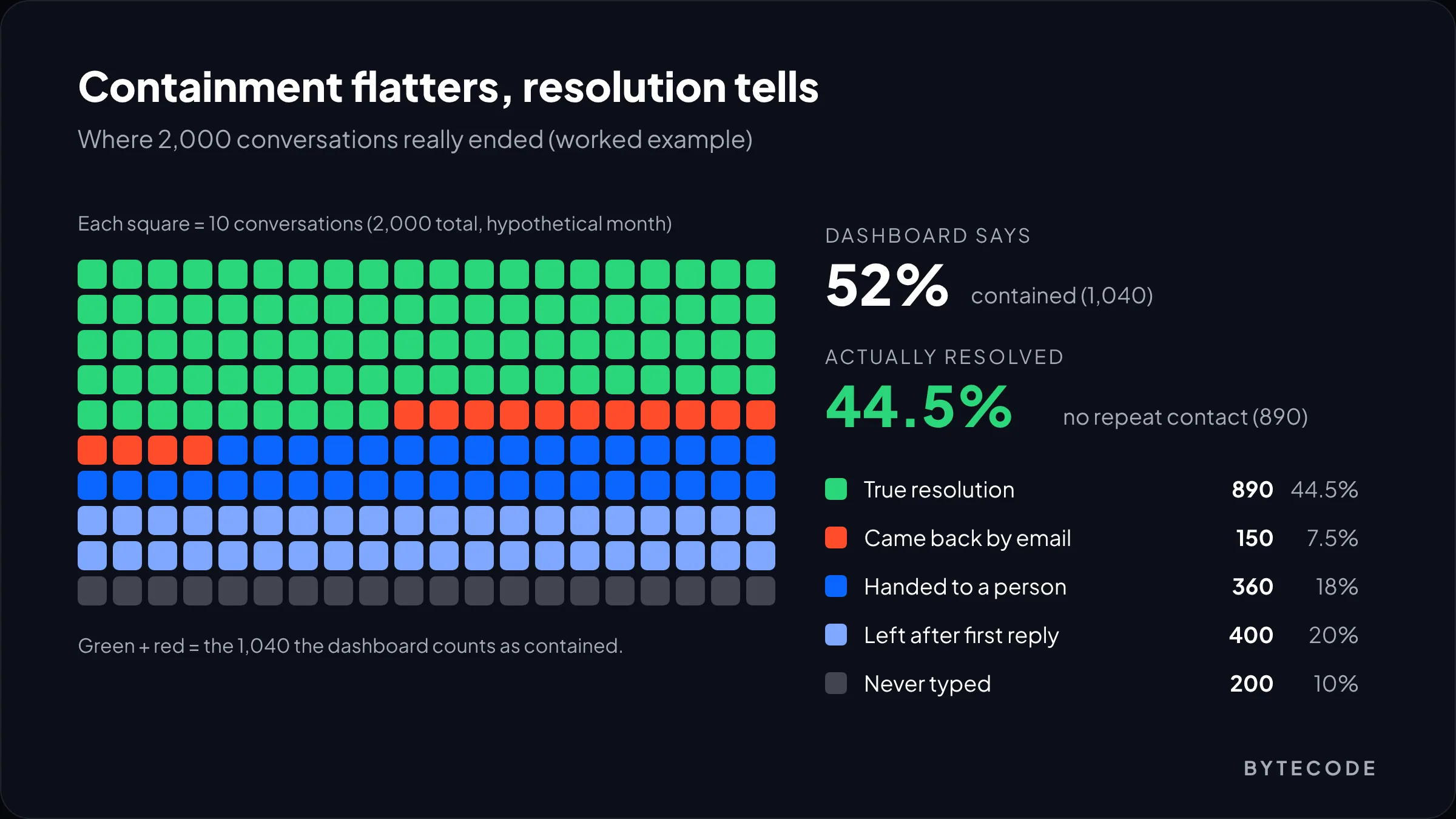
We’d start with the 400 early leavers. Pull 50 of those transcripts and read the first reply in each. Usually the answer buried the useful part or the bot misread a short query. The 200 who never typed point at the empty state.
From our team: metrics come second to reading transcripts. Block an hour a week for someone on the product team to read 30 random conversations. It’s the cheapest research you’ll ever do.
Our conversational UI/UX design team sets up this tracking alongside the interface work.
Frequently asked questions
What is conversational UI design?
Conversational UI design is the practice of designing interfaces where people interact through dialogue, typed or spoken, instead of menus and forms. It covers what the assistant says, the components around it, such as suggested prompts and citations, and the flows for errors and handoff to humans.
What makes a good chatbot UI?
A good chatbot UI states what the bot can do up front, answers in the first sentence, offers suggested follow-ups as buttons, shows sources for factual answers, and makes reaching a human easy. It also respects reading: no autoscrolling past streamed text, and expandable detail instead of walls of text.
How is voice user interface design different from chat design?
Voice user interface design has no screen to fall back on, so responses must be much shorter and lists smaller. Amazon’s guidance suggests responses that can be spoken in one breath and lists of two to five options. Voice also needs read-back confirmation for important details, barge-in so users can interrupt, and spoken cues during pauses.
Should an AI chatbot tell users it is not human?
Yes. Apple’s Human Interface Guidelines say apps should never trick people into thinking AI-generated interaction comes from a human, and Apple also tells developers to check disclosure against the regulations in each region they serve. We recommend a persistent “AI assistant” label in the chat header plus a visible option to reach a person.
How do you make a chatbot accessible to screen reader users?
Put the conversation in a container with role=”log” and an accessible name, so new messages are announced politely without moving focus. Expose the “answering” indicator as a status message under WCAG 4.1.3, keep focus in the input after sending, and make every control a labelled button. With streaming, append the finished answer once rather than token by token.
How do you measure chatbot success?
Measure true resolution rate, meaning conversations solved without a human and without a repeat contact, alongside handoff rate, early abandonment, re-ask rate and per-answer feedback. Containment rate alone is misleading because customers who give up and leave are counted as successes.
What we’d do first
If you already have an assistant live, don’t start with a redesign. Export last month’s conversations and read 50. On each, mark whether the first sentence answered the question and whether the user could reach a person when they wanted one. That beats any workshop.
Then fix in this order: the first sentence of answers, the human handoff, the empty state, and only then the visual polish. Animations and nice bubbles come last.
If you’re starting from scratch, write the sample dialogs before you pick a model or a widget. They tell you what data the assistant needs, and that decides most of the rest. For a second pair of eyes, our conversational UI design services cover chat and voice, from first dialog to the accessibility pass.