On this page
- What goes in a design system
- Design tokens and the W3C format, as of late 2026
- Setting up a Figma design system with variables
- Design system components: build the coded library first
- Build, extend or adopt: a decision table
- Governance: who decides what goes in
- Adoption: how to get developers to actually use it
- Design system cost and timeline: a worked example
- Common design system mistakes we get called in to fix
- Frequently asked questions
- The first 30 days
Open the codebase of almost any product that has been shipping for three or four years and run a search for hex values. On the projects we audit, it is normal to find dozens of near-identical greys, several button components and a Figma file untouched since the last redesign. Nobody planned that. It is what happens when every team solves the same small problem on deadline.
A design system is the fix, but only if developers actually use it. That means tokens in a format both Figma and code can read, a coded component library with real props and tests, documentation that answers “which one do I use here?”, and someone who decides what gets added. Below is how we build one in 2026, with the current state of the W3C tokens format, a build-or-adopt table and a worked cost and timeline.
Key takeaways
- A design system is tokens, coded components, docs and governance. A Figma library on its own is a style guide, and developers will route around it.
- The Design Tokens Community Group format reached its first stable version, 2025.10, in October 2025. It is a Community Group report, not a W3C Recommendation, but the major tools now read and write it.
- Figma variables can now import and export modes as DTCG JSON, so the token file in your repo can be the single source of truth.
- Start with 12 to 20 components taken from an audit of what you already ship, not from a list of everything a system “should” have.
- In our hypothetical worked example, a first release takes about 660 hours over 16 weeks. Upkeep after that is a standing cost, not a phase.
What goes in a design system
A working design system has four layers: tokens (the named values for color, spacing, type and motion), design system components in both Figma and code, usage documentation, and the rules for changing any of it. Pattern guidance and content style are useful extras, but those four are the part your developers touch every day.
We use this table at the start of every engagement. The last column matters most, because teams that build everything at once stall.
| Layer | What it is | Where it lives | Owner | Can you skip it at first? |
|---|---|---|---|---|
| Tokens | Named values: color.action.primary, space.4, radius.md |
A .tokens.json file in the repo, synced to Figma variables |
Design and front-end together | No. Everything else references them. |
| Coded components | Button, Input, Select, Modal and so on, with typed props, states and tests | A package in your monorepo or private registry, shown in Storybook | Front-end lead | No. This is what gets adopted. |
| Figma components | The same components built on variables, with matching variant names | A published Figma library | Design lead | Partly. Mirror the coded set, don’t run ahead of it. |
| Documentation | When to use each component, do and don’t examples, accessibility notes | Storybook docs pages to begin with | Whoever built the component | A dedicated docs site can wait. Notes on every component cannot. |
| Governance | How requests come in, who approves them, how releases and deprecations work | A short contributing guide and a changelog | A named system owner | Keep it light, but write it down in week one. |
Still deciding on flows and screens? Start with our UI/UX design process. A design system codifies decisions; it doesn’t make them.
Design tokens and the W3C format, as of late 2026
Design tokens are the named values every component reads from, and since October 2025 there is a stable, vendor-neutral file format for them. The W3C Design Tokens Community Group announced version 2025.10 on 28 October 2025, naming Style Dictionary, Tokens Studio and Terrazzo as reference implementations and listing Figma, Penpot, Sketch, Framer, Supernova and zeroheight among the tools behind it.
One clarification, because vendors blur it. The Design Tokens Format Module 2025.10 is a Final Community Group Report, not on the W3C Standards Track. That matters less than it sounds. What you need is for your design tool and build tool to agree, and they now do. The details worth knowing:
- Files are JSON, ideally named
.tokens.json. Anything with a$valueis a token. $typeset on a group is inherited by its children. Tools must not guess types from values.- Aliases use curly braces, like
{color.blue.600}. - Dimensions are a number plus a unit (
pxorrem), required even for zero.$deprecatedretires a token without deleting it.
A trimmed example:
{
  "color": {
    "$type": "color",
    "blue": {
      "600": {
        "$value": { "colorSpace": "srgb", "components": [0.043, 0.4, 1], "hex": "#0b66ff" }
      }
    },
    "action": {
      "primary": {
        "$value": "{color.blue.600}",
        "$description": "Fill for the single main action on a screen"
      }
    }
  },
  "space": {
    "$type": "dimension",
    "4": { "$value": { "value": 16, "unit": "px" } }
  }
}
How many tiers of tokens you need
Two, for most products. Primitives hold the raw scale (blue.600). Semantic tokens say what a value is for (action.primary, text.muted), and components only reference semantic tokens. That one rule makes dark mode and rebrands cheap.
A third tier of component tokens (button.primary.background) earns its keep when several brands share one component set. For a single product it mostly doubles the names people have to learn.
From our team: name semantic tokens after the job, never the color. text.danger survives a rebrand. text.red does not.
Setting up a Figma design system with variables
A Figma design system should be built on variables organized into the same collections and names as your token file, with modes for themes like light and dark. Figma can now import and export those modes as DTCG JSON, so you no longer need a plugin just to move values between design and code.
Per Figma’s help page on modes for variables, you right-click a mode in the Variables view and choose Import mode (the file must follow the DTCG format), or Export mode. Right-clicking the collection gives you Export modes for all of them.
The Figma plan comparison lists up to 10 modes per collection on Professional, 20 on Organization, and unlimited with extended collections on Enterprise. Starter has no shared libraries, so a real Figma design system needs a paid plan. The collections we start with:
- Primitives, one mode, hidden from publishing so designers can’t pick
blue/600directly. - Semantic, with Light and Dark modes, every value an alias to a primitive.
- Spacing and radius, one mode, or Compact and Comfortable for dense data screens.
Set scoping on every variable too, so spacing values never appear in the fill picker.
Which side is the source of truth?
The repo. Token changes go through a reviewed pull request and a changelog, and Figma imports the result. Figma-first can work for a solo designer, but you lose review and history.
Watch out: import overwrites the values in that mode. A Figma-only tweak that never reached the repo gets erased by the next import. Agree the direction of sync first.

Design system components: build the coded library first
The coded component library is the part of a design system that actually gets adopted, so build it in step with the Figma library. If <Button> from your package is quicker than writing one, developers use it.
Pick the first components from an audit, not a wishlist: screenshot every screen, group the UI by function, count. For a typical SaaS dashboard the first release looks like this:
- Actions: Button, IconButton, Link
- Form controls: TextField, Select, Checkbox, Radio, Switch
- Feedback: Alert, Toast, inline error text, Spinner
- Containers: Card, Modal, Drawer, Tabs
- Data: Table, Badge, Avatar, EmptyState
That is around 20. Date pickers and data grids are expensive to build accessibly, so we wrap a proven library for those.
What “done” means for one component
A component is done when it has typed props, every state styled from semantic tokens, tested keyboard and screen reader behavior, a story per variant, and a note on when not to use it. Focus rings and target sizes live in the component, so every team inherits them. Our website accessibility guide covers the WCAG 2.2 rules we test against.
Storybook is still the default workshop. Storybook 10.6, from September 2026, adds a skills architecture for agentic workflows and experimental MCP support for Angular-Vite and Vue. If your team generates UI with AI agents, that lets the agent read your real components instead of inventing new ones.
On the Figma side, Code Connect links each Figma component to its counterpart in your repo, so Dev Mode shows your real import and props. It needs a Full or Dev seat on a paid plan, and Professional is limited to one active library and one framework. It answers the handoff question developers ask most: “is this our Button or a new one?”
Build, extend or adopt: a decision table
Most teams should not build every component from scratch. Wrapping accessible headless primitives in your own tokens gets a custom look for a fraction of the effort. Fully custom pays back only at real scale.
| Approach | What it looks like | Fits when | Main trade-off |
|---|---|---|---|
| Adopt a full kit | A complete UI library themed with your tokens | Internal tools, admin panels, one small team | Your product looks like everyone else’s, and deep overrides fight the kit |
| Headless primitives + your styling | Unstyled accessible behavior (for example Radix or React Aria) with your tokens and markup | Most SaaS and customer-facing apps | You own the visual layer and its tests |
| Fully custom | Every component written in-house | Several products, several frameworks, a dedicated system team | Highest cost, and accessibility is entirely on you |
| Shopify theme system | Tokens mapped to theme settings and CSS custom properties, sections and blocks as components | Ecommerce brands on Shopify | The theme editor is your Figma for merchants, so settings must stay simple |
The Shopify row surprises people. A well-built theme already is a small design system: config/settings_schema.json holds brand values, CSS custom properties carry them, and sections are the components. Our post on Shopify theme customization covers extending that safely.
Governance: who decides what goes in
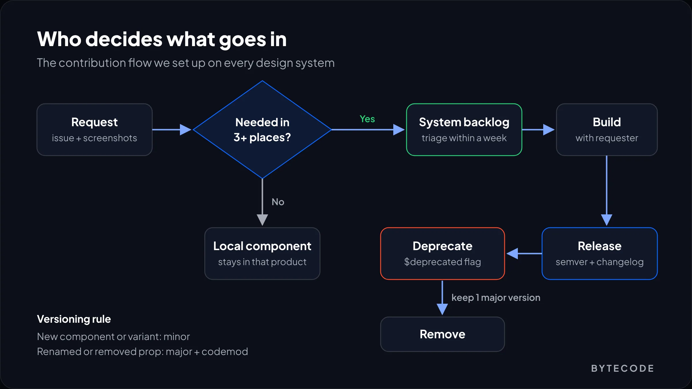
Governance is the written answer to one question: when a team needs something the system lacks, what happens next? Without it, teams build their own, and soon you have two systems.
Staffing is where most programs struggle. The zeroheight Design Systems Report page, summarizing last year’s survey of 147 practitioners, says 3 in 5 teams lacked the people to meet their goals, and only 32% were satisfied with how their organization secures buy-in, down from 42%. So keep the contribution flow short:
- Request. A team opens an issue with screenshots of where the pattern is needed.
- Triage within a week. Needed in one place, it stays local. Needed in three or more, it goes on the system backlog.
- Build with the requester. The requesting team often writes version one; the system owner reviews API, tokens and accessibility.
- Release. Semantic versioning: new variants are minor, prop renames are major, with a changelog entry and ideally a codemod.
- Deprecate, then remove. Flag it with
$deprecatedor a console warning, keep it one major version, then delete.
For one or two products, a part-time owner (usually a senior front-end developer paired with a designer) is enough. Once three teams depend on it, someone’s job title should include it.
Have a design system that nobody is using?
We will audit your tokens, Figma library and component code, and tell you which parts to keep, merge or retire.
Adoption: how to get developers to actually use it
Developers adopt a design system when using it is faster than not, and when somebody is measuring.
In Figma, library analytics shows instances, inserts and detaches per component, style and variable, with up to a year of history, on Organization and Enterprise plans (not Professional). A high detach rate is the clearest sign a component’s variants don’t match real needs.
In code, we track monthly: files importing the system package, raw hex values left in stylesheets, and local components that duplicate system ones. A Stylelint rule drives the second number down:
{
  "rules": {
    "color-no-hex": true,
    "color-named": "never"
  }
}
Start it as a warning. Make it an error across a legacy codebase on day one and it gets disabled by Friday. What else drives adoption, in our experience:
- Migrate one real screen yourself. It proves the components hold up and gives teams a reference.
- Ship codemods with breaking changes, or teams pin the old version forever.
- Answer questions the same day in a dedicated channel. That beats any docs site.
- Report the numbers monthly to leadership, which is how buy-in survives.
Design system cost and timeline: a worked example
A first production release of a design system for a mid-sized product typically takes 3 to 4 months and roughly 500 to 800 hours, in our planning experience. Upkeep is ongoing after that.
Say you are a B2B SaaS company with two React apps and a marketing site, about 140 screens, and no shared components. You want light and dark themes and about 20 components. This is a hypothetical planning scope, not a client project.
| Phase | Weeks | Hours | US agency at $150/h | Hybrid team (lead h + build h) |
|---|---|---|---|---|
| UI audit and inventory | 1–2 | 40 | $6,000 | 40 + 0 = $6,000 |
| Tokens, themes and build pipeline | 2–4 | 60 | $9,000 | 20 + 40 = $4,600 |
| Figma library on variables, about 20 components | 3–9 | 120 | $18,000 | 20 + 100 = $7,000 |
| Coded components, stories and tests | 4–13 | 280 | $42,000 | 20 + 260 = $13,400 |
| Usage docs and Code Connect | 8–14 | 50 | $7,500 | 0 + 50 = $2,000 |
| Pilot migration of one product area | 11–16 | 80 | $12,000 | 10 + 70 = $4,300 |
| Governance, release process, team training | 14–16 | 30 | $4,500 | 30 + 0 = $4,500 |
| Total | 16 weeks | 660 | $99,000 | 140 + 520 = $41,800 |
The hybrid column assumes a US-based lead at $150 an hour for the audit, governance and reviews, and an offshore team at $40 an hour for most build hours. Same 660 hours, 58% less. Both rates are planning assumptions. Divide any quote by its hours to see which model you are being offered.
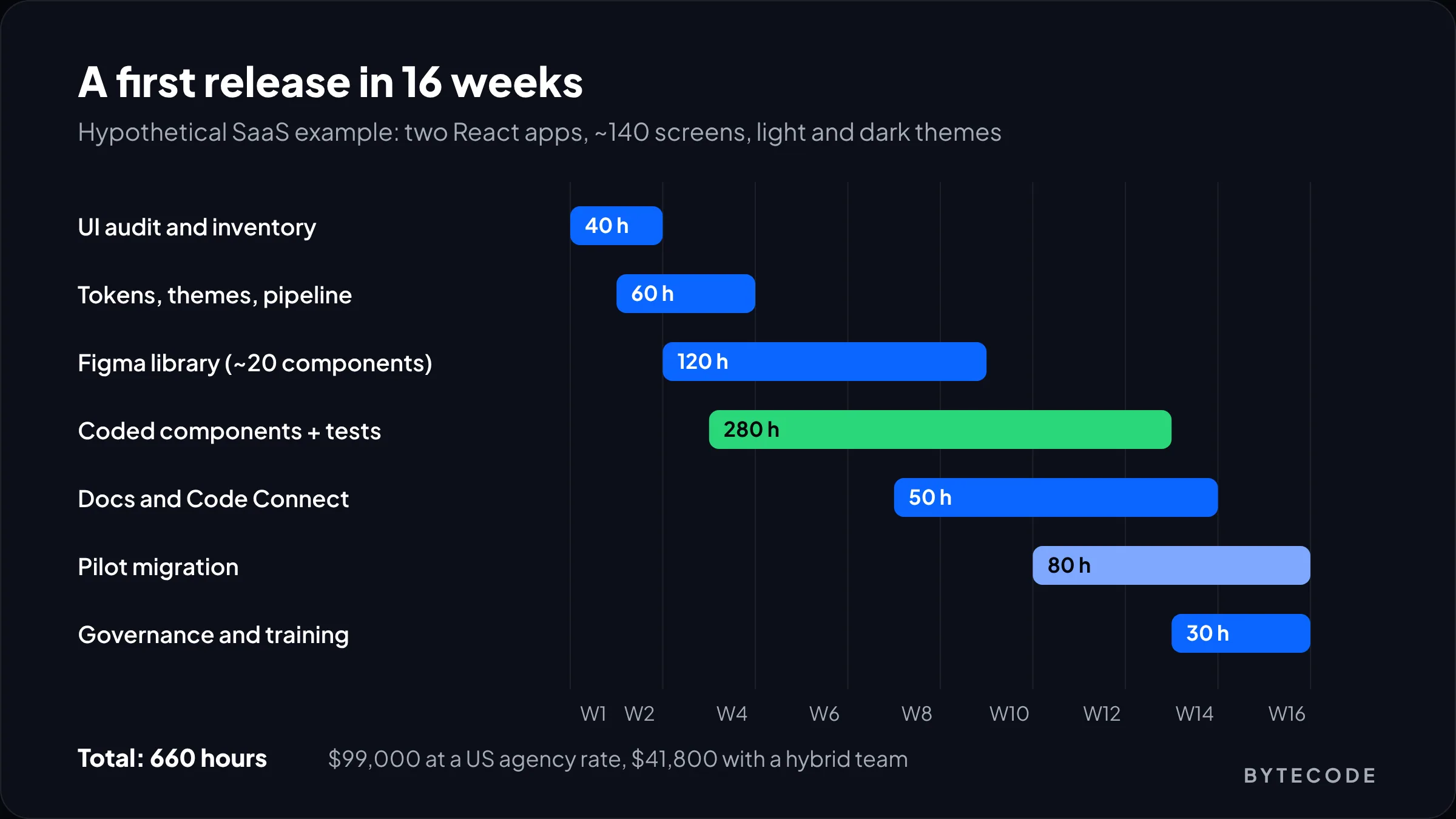
Then budget for the year after. A system serving two or three teams needs half to one and a half people’s time for variants, fixes and upgrades, in our planning, plus Figma seats on a plan with libraries. Our UI/UX design services team scopes the run phase before work starts, because that is where systems quietly die.
Common design system mistakes we get called in to fix
The most common failure is a design system that exists only in Figma. The second is one built for a hypothetical future product instead of the one in production.
Figma first, code “later”
Designers publish a beautiful library, developers keep shipping their own buttons, and within a quarter the two drift. Build the coded component in the same sprint, or hold the Figma one back.
Too many tokens
Three hundred semantic tokens on day one means nobody picks the right one. Start with what your audit found and add names on request.
Wrapping a kit too thinly
Re-exporting a third-party kit with new colors gives you its API and its upgrade schedule. Define your own props so you can swap the inside later.
Treating dark mode as phase two
If components reference primitives directly, a theme later means touching every component. Semantic tokens from day one avoid that.
Frequently asked questions
What are the main components of a design system?
A design system has four main parts: design tokens for color, spacing, type and motion, a component library built in both Figma and code, usage documentation, and governance rules for changes and releases. Pattern guidance, content style and brand guidelines often sit alongside these, but tokens and coded components are what developers rely on every day.
What is the difference between a design system and a component library?
A component library is one part of a design system. The library is the set of reusable UI pieces, such as buttons and form fields. The design system adds the tokens those pieces are styled from, the guidance on when to use each one, and the process for changing them. A library without those tends to fork as soon as teams disagree.
Are design tokens a W3C standard?
Not formally. The Design Tokens Format Module 2025.10, released in October 2025, is a stable Final Community Group Report from the W3C Design Tokens Community Group, and it is not on the W3C Standards Track. Even so, it is the shared format that tools like Figma, Style Dictionary, Tokens Studio and Terrazzo support, so it works as the standard in practice.
Can Figma export design tokens?
Yes. Figma can export variable modes to JSON files in the Design Tokens Community Group format. Right-click a mode and choose Export mode, or right-click the collection and choose Export modes. You can also import DTCG token files into a mode, but importing overwrites that mode’s existing values, so agree which side is the source of truth first.
How long does it take to build a design system?
A first production release usually takes 3 to 4 months for a mid-sized product, covering an audit, tokens, around 20 components in Figma and code, documentation and a pilot migration. Our hypothetical worked example comes to 660 hours over 16 weeks. A system is never finished, though: plan for ongoing maintenance as soon as the first release ships.
How much does a design system cost?
For a mid-sized product, a first release typically costs from about $42,000 with a hybrid onshore and offshore team to around $100,000 with a US agency, based on our 660-hour planning example. Larger multi-brand or multi-platform systems cost more. Budget separately for Figma seats and for the half to one and a half people needed to maintain it each year.
The first 30 days
If we were starting your design system tomorrow: week one, screenshot every screen and count what you ship. Week two, write the token file in DTCG format, commit it, and import it into Figma as Light and Dark modes. Weeks three and four, build Button, TextField and Card in code and Figma, and put them on one real screen.
Small on purpose. Three components on a live screen teach you more than three months of planning. Grow only as fast as people adopt it.
We have designed and built interfaces for brands like Delsey, EcoFlow and Kerbholz, and we set up design systems that both designers and developers keep using. If you want help scoping yours, take a look at our UI/UX design services and tell us what you are working with.